How to make a hand-drawn highlighted web page header
Posted: - Modified: | drawing, sketches, wordpressFor the longest time, I’d been meaning to make my website look more hand-written and to take advantage of Google Web Fonts to make my site feel slightly different. After some design-related nudging from Matt Tanguay, I finally got around to it. Here’s how! =)
For comparison, here’s the “before” picture:
After (I tweaked the links, too):
If you’re already comfortable with HTML and CSS, it turns out to be pretty easy to make a hand-drawn website with highlights that appear when you hover over links. Here’s how!
Step 1: Draw the header image.
It can be more efficient to have one medium-sized image instead of lots of little images, and it’s easier to work with one image instead of many small ones. You’ll use CSS to split this up into rectangular regions later, so keep that in mind when designing your image and try to avoid overlaps.
I drew the main image using Autodesk Sketchbook Pro, but you can use any image-drawing program. You can even draw it on paper and then scan it in.
(I didn’t end up using the Random Page! button, but that’s okay. =) )
Step 2: Add highlights.
I added another layer below my main layer and highlighted whatever I wanted to highlight, making sure things were separated by enough whitespace so that the highlights didn’t overlap into another link’s rectangle. If you’re doing this on paper, you can highlight on paper as well.
You’ll notice that everything is highlighted in this image. No worries! We’ll display just the appropriate part later.
Step 3: Set guidelines.
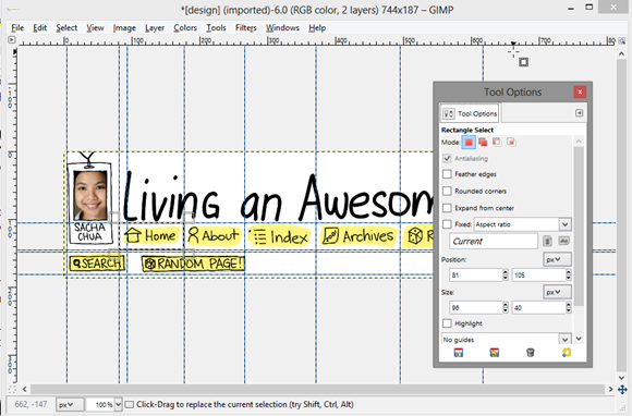
Setting guidelines using a photo editing tool like the GIMP will make it easier for you to select consistent rectangles. Here, you can see how I’ve set up my guidelines to make it easy to select a rectangle containing the “Home” link. You can use the rectangle selection tool to get the position and size, which you can find in the Tool Options window.
Step 4: Write your HTML and add IDs/classes to it.
Code your HTML so that the text makes sense, and then use CSS to replace the text with images and to lay things out for your intended design.
I added IDs and classes to my links to make it easier to replace the links with images later on.
<ul class="links" style="margin-bottom: 0">
<li><a id="home" class="replace home-design" href="/">Home</a></li>
...
</ul>
Step 5: Replace the text with your images using CSS.
There are a number of CSS text->image replacement tutorials out there. The general idea is to use text-indent to hide the text, and then use background, background-position, width, and height to display the right portion of your image.
This is where the guidelines from Step 3 come in handy. Simply make the position negative and use that as the background position, then use the size as the width and height.
.home-design { background: url(images/design.png) 0 0 no-repeat; }
.replace { white-space: nowrap; overflow: hidden; text-indent: 100%; }
#home { width: 96px; height: 40px; background-position: -81px -105px; display: inline-block }
.header .links .replace:hover { background: url(images/design-highlighted.png) 0 0 no-repeat; }
Tada!
Still have questions? Please comment below – I’d be happy to explain more!


